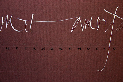
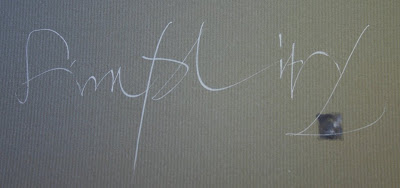
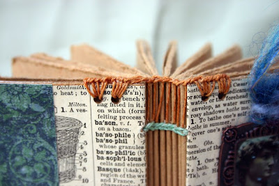
Here are photos of the lettering that I did in the workshop. Yves' preferred lettering tool is the humble and unloved Speedball C5. So many experienced and established calligraphers (Sheila Waters comes to mind) have said that any Speedball nib smaller than a 3 is useless because of inconsistent manufacturing.* But Yves swears by them, and after a bit of warming up, they worked fine. It was hard to believe that we could get such lines from a lowly Speedball nib. The white paper is Arches text wove, and the darker papers are Bugra. The abstract color square in the first photo is done with my old favorites, Twinkling H2Os.


 These little abstract marks were about 2 X 3" and done over some watercolor backgrounds that I had previously done in a journal.


* In a note of clarification Sheila said, "I would be talking about not to expect predictable sharp thicks and thins for relatively slow, precise formal writing. Gestural writing is quite different, needing speed, and Speedball smaller C series nibs would be fine for that....I would never use the term "useless" about any tool, especially nibs, because it depends on what you want to use them for..."
Thank you, Sheila, for the explanation.


