
As always, thanks for looking!


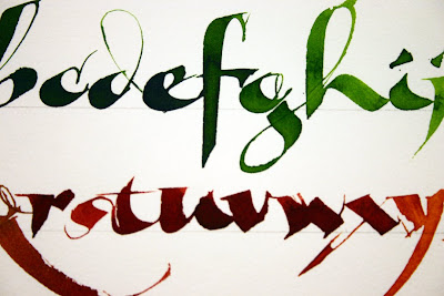

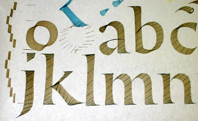


 Then there was the faculty exhibit. I took a number of photos, but since most of the pieces were under glass, they were hard to photograph. Here are two that caught my eye -- the first one is Rosie Kelly's book, which was in a case. I can never get enough of looking at her work!
 This is just one panel of many that were hanging from a clothesline (for lack of a better word) by Lisa Englebrecht. I believe it was a book, with all the pages hanging next to each other.
 When I arrived at conference I was greeted with excitement about my Martin Luther King painting. I was so honored and humbled that it was placed at the entrance to the Chicago guild's Exploration 2008 exhibit in this very prominent position. I still can't quite get over it.
 One of the unique features about this conference were the Mini Workshops. It was like having a conference within a conference. Here is the book I made in one of the classes I took. It was so cool -- I just had to know how to do this beaded binding! Class was taught by Barbara Mann.
 I have more photos, and will keep posting them until I run out! My dining room table is still covered with supplies from conference, and will have to be cleaned up before we have guests this weekend. And the big Martin Luther King painting is still in a box in the corner! Shipping that piece home was an adventure!


 These little abstract marks were about 2 X 3" and done over some watercolor backgrounds that I had previously done in a journal.


 We did pages and pages of practice work! Then around the middle of the 2nd day we started to do some things on individual sheets, like this repetition exercise, when we were allowed to add color! Everything that we did during the week was a progression, building in succession on what he had taught before. It was challenging to remember it all and implement in into new exercises as the week went on. Here are some samples:
 Yves' "artifex" demo:
 Another demo by Yves:

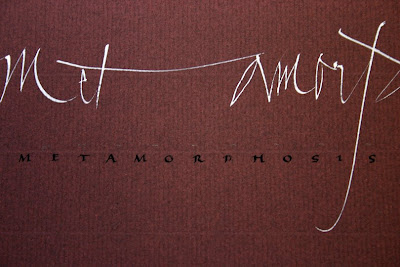
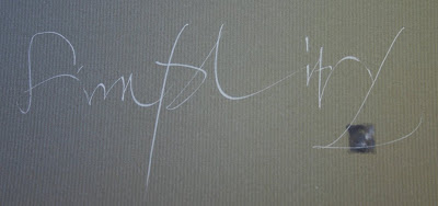
 Another repetition exercise by Yukimi Annand:


 Here is one of the buildings on the school's campus. It was beautiful when the sun finally came out.
 This is one of the projects that we made in Michael Jacobs' sketchbook and journals class. It has two portfolios, two mini-sketchbooks, and another small journal. Very cool.


